Years ago, I was discussing design issues with a licensed interior designer who happened to be familiar with my career as a decorative artist and architectural color consultant. At one point in the conversation, she uttered, “Any monkey can do color.” She didn’t say it harshly or with malice, but rather, she said it without thinking. Her comment has stuck with me, not because it hurt my feelings, but because I believe that attitude permeates our society. There are many design professionals who think that 1) there is no strategic or business reason for using a particular color, 2) any color palette will do and, therefore, 3) color is easy, 4) anyone can do it, and 5) it doesn’t matter because it can always be changed. Unfortunately, these beliefs are harmful to all of us who live in residential or commercial environments. How so?
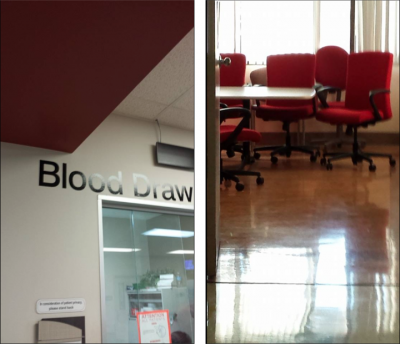 Recently, the husband of a very dear friend of mine was having major surgery. We all know how emotionally and spiritually stressful major surgery can be on both the patient and their family members. So imagine how horrified I was – as well as her family and friends – when she posted these pictures of the pre-surgical waiting areas. Whoever selected these inappropriate colors showed no sensitivity at all as to how those colors add unnecessary stress to families already trying to cope with the angst of surgery on their loved ones. A soothing color palette not only would not cause more stress, but can actually reduce anxieties and comfort everyone involved.
 Another example of poor color choice is the TSA security check at most airports. No one enjoys waiting in long lines like cows herded into holding pens. Add to that taking off shoes and placing personal effects in a container that has held thousands of other people’s shoes (and germs), officials wearing rubber gloves, etc. This vastly uncomfortable scene is made worse by the dour colors of most such environments – cold, harsh florescent light above gray carpet with gray walls that subtract humanity and make an already stressful situation worse. Not only has it been proven medically that the right mix of colors and lighting can relax passengers and lift morale, but studies in which artwork, mobiles with cheerful colors, and plants were placed in airport security areas showed that passengers processed through the systems an average of 30% faster than without those colorful benefits.
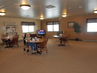 My last example focuses on color in senior living centers. In our society, seniors are all too often treated as though they are invisible. Unless they have substantial funds, the group environments that many live in – even when they would rather not – are often drab, somber, and demoralizing. Rather than the colors lifting their spirits, the poorly-chosen colors of these establishments can drain residents of hope and joy at a time when they need them most. Again, the right colors could enhance their lives, and make them feel more like getting well and enjoying life again.
So here’s my overall point: Color is not an ornament. Color is not fluff. Color has very real purposes and benefits, and it must be chosen correctly. Color is a tool that works together with architecture and light to create environments that enhance our life experience day in and day out. So let’s do it right. Let’s think of the people and their lives. Let’s create color palettes that work well together in unison and harmony with architecture. Color palettes that make people smile! Our spirit and our lives depend on it.
Thank you for taking the time to read this, and excuse me while I go get a banana.

7 Responses to “Any Monkey Can Do Color.”
Brilliantly said!
Thank you!!!
This is an excellent article Gloria.
Thank you Brenda!
I am still horrified by not only the red color in the blood drawing area, but even the shade of red! Goodness, how awful! And I would think that brighter happy colors should be used in senior centers, since they don’t see colors as well as they used to. Colors can also define certain areas better, especially when dementia is an issue. Well said Gloria.
Hope you enjoyed that banana 🙂
Such a fabulous read! Love your humour as well!
Thank you! You really see this stuff often — mis-application of color — or color not used correctly to help — to the detriment of people/patients/families often. Thank you for your comment and, hopefully, with all our efforts, we can make the design community more aware of how color can actually help people (and their family and friends) on a physical, emotional and spiritual level.